

An A4 12pp travel magazine I created in response to a brief to write an essay on our chosen theme, and then to design a magazine to support the essay. I used Adobe InDesign, Photoshop and illustrator. My theme was travel landscapes and I wrote my essay on why we travel and how it affects our mental health. I used personal travel photos and combined these with graphics to enhance the pages. I also experimented with typography to support each destination.

An A4 12pp magazine celebrating feminist icons. It was created for my EPQ at college using Adobe InDesign, Photoshop and Illustrator. I researched different feminist icons and designed a page for each inspired by their work and the eras they were born in. Each page has typography and an illustrative style to represent the era in which they became well known.


While studying at the University of Creative Arts (UCA) I worked on a brief to design three book covers for one author. I chose the author Neil Gaiman. I initially researched his wide range of published work and then started by gathering reference material and imagery that complimented his style of writing and the subject matter. I then began sketching my initial ideas for the three book covers. After working through various concepts I decided I liked the concept of having a mirrored pattern. I also used related imagery to inspire the concepts for the final covers.

This example shows the contextual source research and development for a travel app I created for my final A-Level project at college. In this image, I created the two main illustrations based on the work of Dave Thompson. I chose his work as the inspiration and influence for the main style of illustrations throughout my travel app.

This image shows the contextual source research and development for a travel app I created for my final A-Level project. I used Adobe Photoshop to create the background for these pages inspired by Yaroslav Iakovlev. His work influenced (images on the left) the shapes and swirls I combined with other graphics throughout the various app backgrounds I generated.

For the travel app logo, I started my research by exploring relevant types of logos and reviewing various styles of app icons. After this initial research, I started to work on concepts for my app logo. This example illustrates how my design evolved and developed. My initial ideas are shown on the right-hand side of the image.
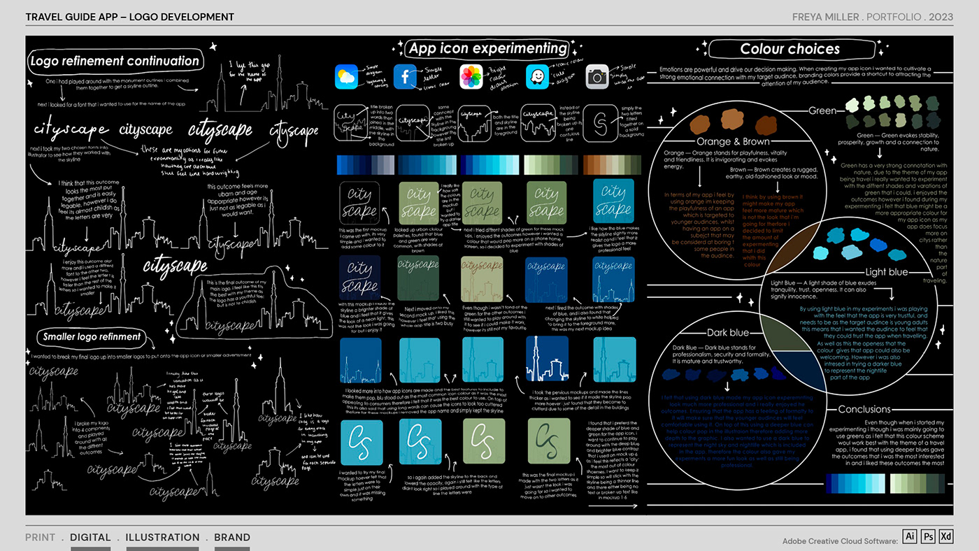
This image demonstrates my process of refining and experimenting with options for the travel app logo and the development of the app icon. The example also highlights the creative process I went through to explore different colour palettes for use throughout the app.

Once I had a logo and icon design and I’d decided upon a colour palette, I started to design the user interface and began planning how the app screens would work. Through research I started to develop the welcome page, initially sketching out the necessary content. The illustrative style was inspired by Dave Thomson. These design concepts were created using Adobe Illustrator.

To enhance the destinations and information sections throughout the app I wanted to expand the style of illustrations to incorporate texture over the solid colour. I experimented with texture styles inspired by the illustrator Martin Hake. Using the base style from Dave Thompson, I added texture to my illustrations to give them more depth.

To create impact on the homepage I wanted to experiment with various travel images to see which would work best in the visual space so the app was engaging yet informative. This image shows my rough sketches using Adobe Photoshop.

Within the various sections of the app I wanted to see how the illustrations would work when the user chose a specific destination. This image demonstrates the Edinburgh section of the app. I made rough sketches of venues from around the city and experimented with the placement of these illustrations in relation to the title and the rest of the content.

For the final Edinburgh screens within the app, I created these final illustrations using images of specific venues. The illustrations were created using Adobe Illustrator by referencing photographs from around the city.

As part of the app development I wanted to create a consistent style for the section headings and so experimented with various fonts for these titles. I explored combining a sans serif font with a handwritten or script font. This was to represent the informative and structured benefits of the app, combined with the freedom, flexibility and enjoyment of travel.

For each section of the travel app, I experimented with type and positioning the text so the sections would scroll seamlessly for the user. I also included additional graphics to help with the flow of the content across the various destinations and to help break up text-heavy listings.

In the final stages of the app’s development, I created a city map highlighting where all the venues featured in this section of the app were situated in Edinburgh. I used Adobe Illustrator and Photoshop to create the map. I added texture over parts of the map for more depth and to make the information more visually engaging. In this image, I have included some additional information on either side of the map which summarises the development and progress of the app development throughout the project.

I created the final app pages for the Edinburgh section and designed them so they worked as a continuous scrollable page. I used Adobe Xd to create a prototype of the app and to test its usability. I also used this prototype to check how the sections worked throughout the various destinations.

This image shows mock-ups of the various app screens on a smartphone. The mock-ups show the log-in screen, a welcome section, a specific destination (Edinburgh) and how the map responds on a mobile phone when viewed as landscape.

This is the final evaluation that I wrote in response to my A level graphics project, explaining my process and development of the project.

An icon set and a framework infographic I created for use in ‘Designing Accessible Learning Content’, a book published by Kogan Page for eLaHub.net. The book is a practical guide which helps eLearning practitioners understand how to make eLearning accessible to all users. This work was part of my work experience at a design agency. The icons were designed to signpost the reader through the book. They also helped them reference how topics referred to the relevant Web Content Accessibility Guidelines (WCAG version 2.1).

A5 leaflet and A4 white paper for eLaHub.net, to help explain to eLearning designers the importance of creating eLearning material that is accessible to all users. The content was supported throughout by bold infographics to highlight the importance of accessible content and the impact it has globally. This work was part of my work experience at a design agency. I used Adobe Illustrator to create the infographics and InDesign to artwork the leaflet and white paper.

At UCA I worked on a brief to design a typeface based on a chosen stimulus from a list given in the brief, my chosen stimulus was David Bowie. I began by researching and experimenting with different typefaces and symbols that I accumulated when looking into David bowie and the design that already surrounded him. Another section of the brief was to create posters presenting my final typeface, they are on the right of the image.

At UCA I worked on a brief to redesign the existing National Railways logo. The brief originated out of a discussion around the new proposed logo that incorporated the Union Jack and a name change to British Railways. In response to the brief I initially critiqued the existing and new logo. I then researched examples of other railway logos from around Europe and how they developed throughout the years. I was fascinated to explore why they had changed, and the positive and negative outcomes of the rebrands.

I started to explore a graphic that could work as an icon by combining the initial caps B and R. I was keen to demonstrate a network of railways across Britain within the design of the icon. This led me from a softer rounded style to a stronger and more angular style to represent train tracks and to create a directional graphic. The final logo is shown at the bottom of the page. I have also shown two examples of the early stages of development demonstrating how the logo can develop into a brand for use across advertising.

As part of my work experience at a design agency, I worked on a new brand for a company that sold antique and contemporary furniture and collectables for the home. The name of the company is made up of the two surnames of the business partners. To capture the traditional and contemporary feel of the business we wanted to use strong typography combined with an ornate ampersand to show the connection between the partners. I researched various ampersand styles and tried these with various fonts and also looked at different positions of how the ampersand could work within the name.

As part of my work experience, I was involved in analysing colours for a project focusing on accessible design. I worked on the collateral the agency had produced for a ‘Visit Southampton’ campaign and used colour contrast analyser software to check that the colours used for text and backgrounds were accessible. The software calculated if the colour values used in the artwork passed the WCAG 2.1 standards. This experience sparked my passion for inclusive design and helped me to understand how important it is for designers to consider accessibility when working on all projects.


